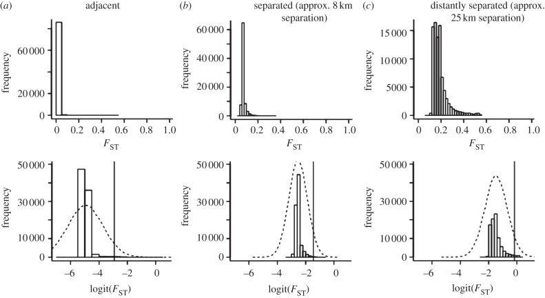
Figure 4.
The distribution of FST values under different degrees of geographical separation. The top panel shows the distribution of FST values across individual loci for three different pairwise comparisons: (a) 1A × 1C. (b) 2A × 5C. (c) 2A × 1C. The bottom panel presents a bar plot of the distribution of point estimates for logit(FST) across the genome for these same comparisons. The dashed black line is the genome-wide distribution of logit(FST)(i.e. the Gaussian normal hierarchical prior for locus-specific logit(FST)). The vertical line in each pane denotes the 95th quantile of the genome-wide distribution, which was used to delimit high FST outliers. The FST distribution tended to be the most ‘L-shaped’ for geographically adjacent pairs and became less ‘L-shaped’ with increasing geographical separation of populations. See electronic supplementary material for statistics involving all 28 pairwise comparisons.

