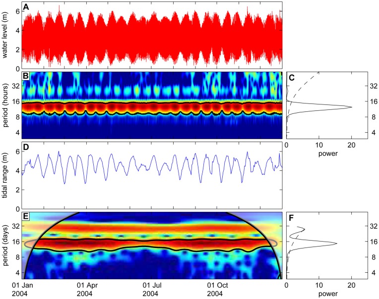
Figure 3. Wavelet analysis of the tidal data.
(A) Time series of water level measured at station Sheerness in 2004, with the corresponding (B) wavelet power spectrum and (C) global wavelet power spectrum. (D) Time series of tidal range, with the corresponding (E) wavelet power spectrum and (F) global wavelet power spectrum. The wavelet power spectra in (B) and (E) are presented as contour plots, where the y-axis plots the periodicities in the time series, and the x-axis plots how these periodicities change over time. Color coding indicates the wavelet power, ranging from low power in blue to high power in red. Red areas surrounded by black contour lines enclose significant regions in the wavelet power spectra (i.e., regions of >95% confidence that the local wavelet power exceeds red noise). Shaded areas on the left-hand and right-hand side of the two thick black lines in (E) represent the cone of influence, where edge effects might distort the signal. Results in the cone of influence are therefore excluded from further analysis. Panels (C) and (F) show global wavelet power spectra of the time series (solid lines). Peaks exceeding the 95% confidence level of the corresponding red noise spectra (dashed lines) are significant.

