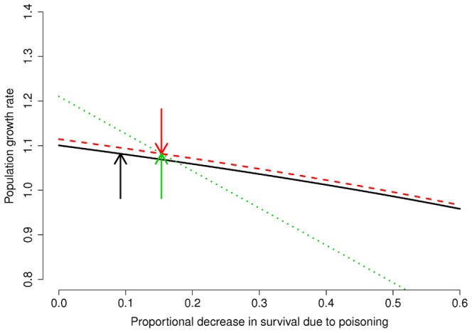
Figure 2. Changes of population growth rate in relation to changes in the proportional decrease of age-specific survival probability.

The black solid line represents the relationship with proportional reduction in juvenile survival ( ), the red dashed line refers to
  , and the green dotted line refers to
  . Current age-specific values of
  are indicated by the arrows with the same colour of the curve to which they refer.
