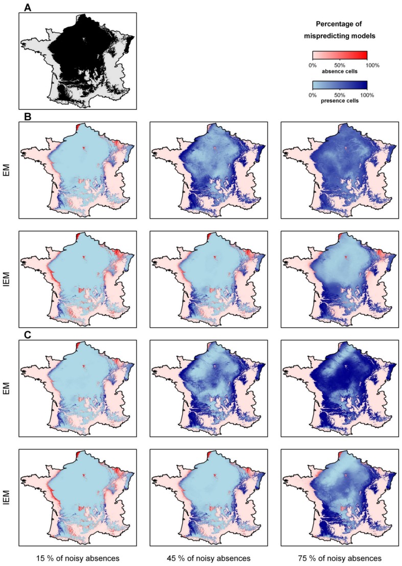
Figure 5. Distributions of the frequent species (prevalence = 60%).
(A) The observed distribution; (B) the predicted distributions using noisy absences randomly located; (C) the predicted distributions using noisy absences following a distance gradient from the center of the environmental niche. For each noisy absence type, the top line of 3 maps refers to EM and the bottom line maps to IEM. For each line, noisy absences increase from the left to the right (left 15%, centre 45%, right 75%). The situations with 30% and 60% of noisy absences are not shown for clarity. The 100 models based on the 100 different learning data sets were used and we evaluated the percentage of mispredicting models in each pixel. The darker the pixels, the higher the percentage of prediction errors.

