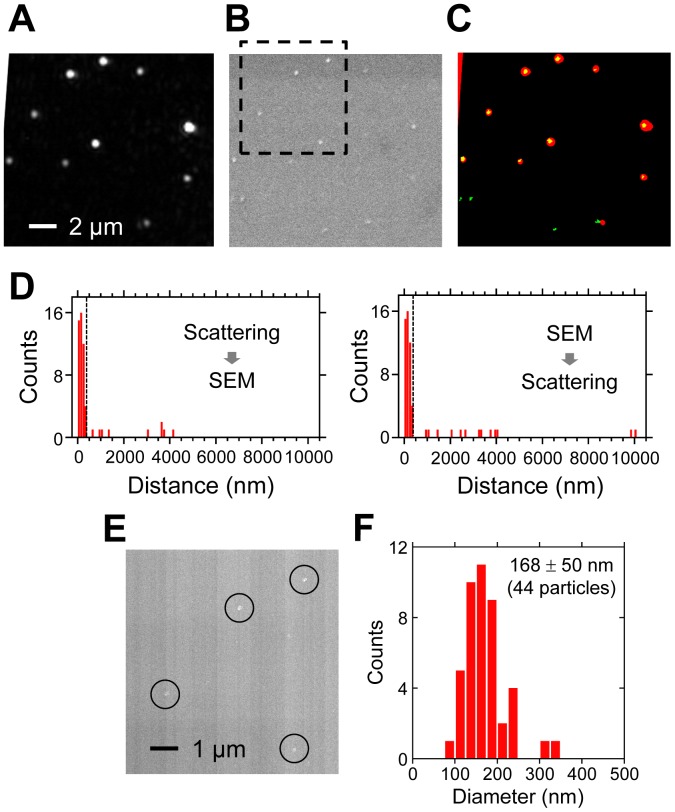
Figure 4. Correlation between scattering and SEM images of viruses.
. (A) Scattering image. (B) SEM image. (C) False-color superimposed image of binarized scattering (red) and SEM (green) images shown in A and B. (D) Distribution of the distance between scattering spots (spot in SEM) and nearest-neighbor spots in SEM (scattering spot). We considered scattering and SEM spots within 400 nm (dashed line) as signals from the same particle. (E) FE-SEM image. The area enclosed by the black dashed square in Figure 4B is shown. The particles are indicated by circles. (F) Distribution of the diameter of each particle measured in the FE-SEM images.

