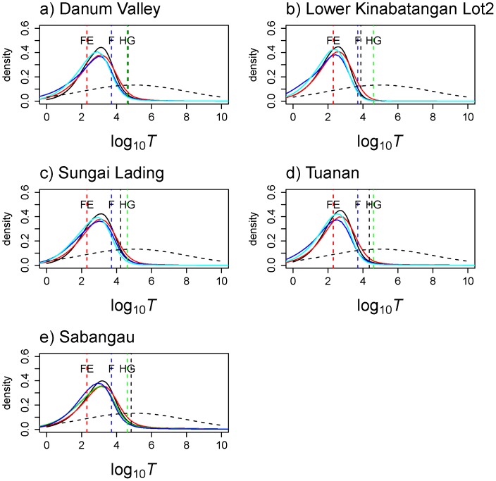
Figure 4.Time. since the population collapse using MSVAR 1.3.
The posterior distribution for the time since orang-utan populations (all) collapse started is represented on a logarithmic scale. The different coloured vertical dashed line corresponds to: forest exploitation (FE in red), arrival of farmers (F in blue), and arrival of hunter gatherers (HG in green). The most extreme 95% quantile of the posterior distribution is shown as a black vertical dashed line. The prior is shown as dashed line, its median being 100,000 y ago.

