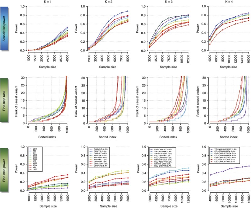
Figure 1.
Overall performance of trans-ethnic meta-analysis and fine-mapping. The panels in the top row quantifies the power to identify an association in a single population (K=1, first column), and in meta-analyses across either two, three or four populations (second, third and fourth column, respectively), at different sample sizes. The middle row represents the ranking of the association signal at each causal variant across all 1000 iterations when considering a sample size of 4000 cases and 4000 controls within each population. The lowest attained value on the vertical axis is 1, which indicates that the causal variant is correctly identified as the SNP displaying the strongest association signal. The horizontal axis represents the 1000 iterations of the simulation. The bottom row represents the power of identifying the causal variant as the SNP with the strongest association signal at different sample sizes. The color of each line for three panels in each column corresponds to a specific population configuration, which is summarized in the legends in the bottom panels along with the FST values estimated across all the autosomal SNPs in the genome. For K=2, 3 and 4, the colors of the lines are assigned according to the FST such that population configurations with increasing FST are assigned warmer colors (from blue to red). Each causal variant is chosen to possess a MAF of between 20 and 50%, and to be in perfect LD with at least five other neighboring markers in the CEU panel.

