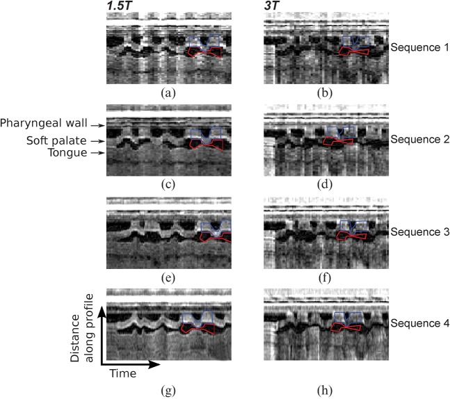
Figure 3.
Example intensity–time plots for all sequences in one subject at (a, c, e, g) 1.5 T and (b, d, f, h) 3 T covering the first 5.7 s of speech. These plots are generated by producing an intensity profile along the reference line (see Figure 1). Intensity profiles from adjacent time frames are stacked side by side to represent the time axis in the x direction. Increased temporal fidelity is evident moving in the vertical direction, going from (a–d) 9 or 10 fps, to (e, f) 14 fps and (g, h) 20 fps. The regions of interest (ROIs) used for the signal-to-noise ratio measured in a short section of the intensity–time plot are superimposed in blue (signal ROI) and red (noise ROI).

