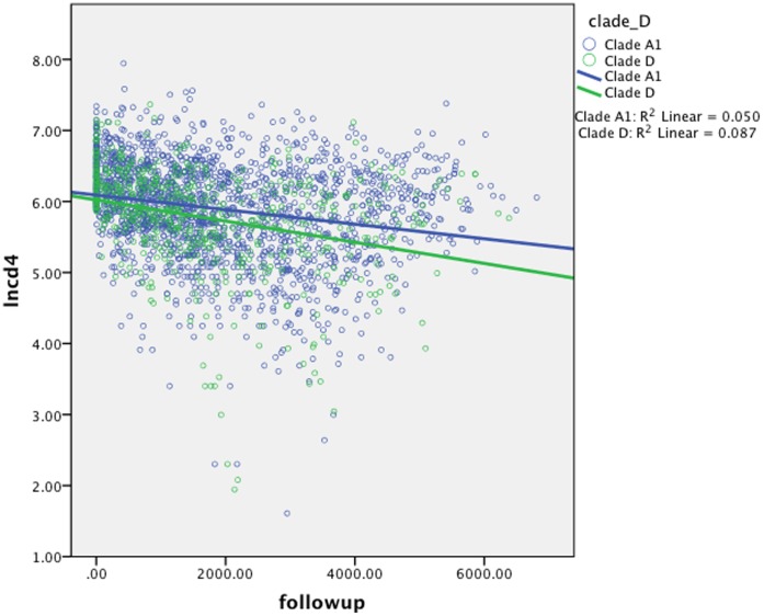
Figure 1. Scatter plot showing slopes of decline of natural log CD4 (lnCD4, y-axis) over time (x-axis).
Dots indicate individual CD4 measures, while lines indicate mean slope of decline for participants infected by Clades A1 (blue) and clade D (green). These were analyzed using linear mixed models (Table 2).

