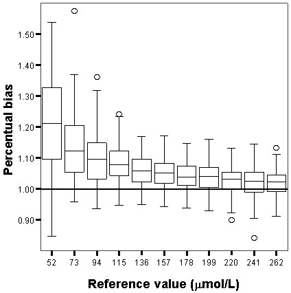
Figure 1.

Box and whisker plot showing the percentual bias of the Jaffe technique. Box and whisker plot showing the percentual bias for the Jaffe technique . Interpretation of the vertical axis e.g. 1.1 means a percentual bias of 10%. The box represents the 25th, 50th and 75th percentile; the whiskers represent the 5th and 95th percentile. The extremes, defined as values more than three times the interquartile range, are the signs above and underneath the whiskers. The grey line represents the 0% bias line.
