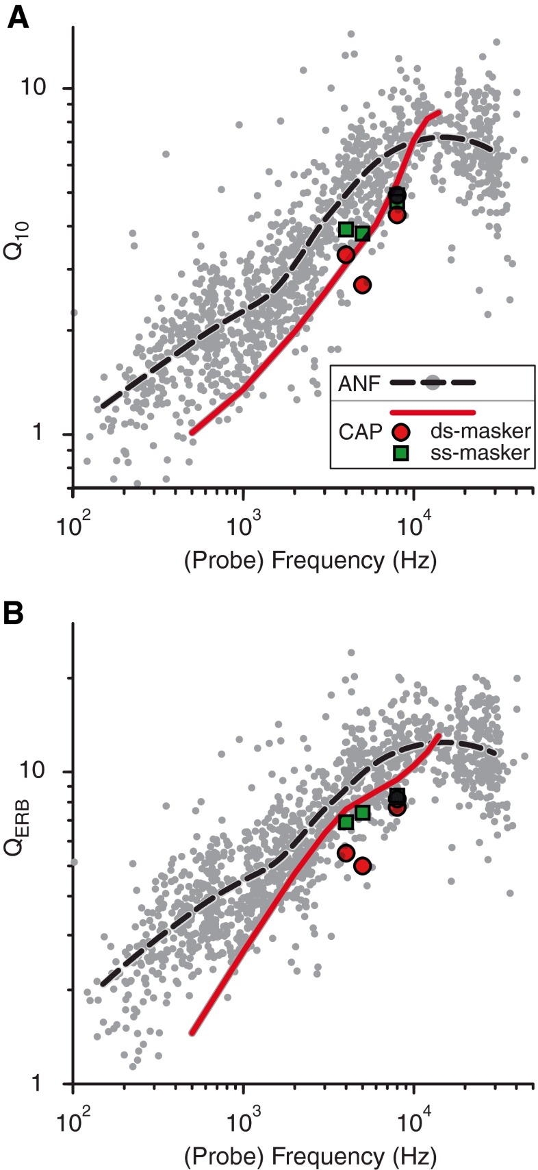
FIG. 15.
Comparison between Q factors from CAP (red lines, same data as in Fig. 8 but on a log-log scale) and single ANFs (gray dots, 1,200 units, 28 cats; threshold level range −10 to 67 dB, spontaneous rate 0 to 136 s−1, unpublished data) as a function of frequency for cat. A Q 10 and B Q ERB. For ease of comparison, smoothed AN trend lines (dashed lines, RLOWESS, MATLAB) are included in both panels. Additional Q 10 factors from the accurate MTCs in Figure 14 with double-sided and single-sided maskers are included as the red circles and green squares.

