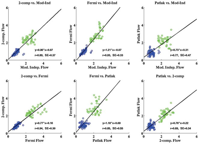
FIG. 4.
Scatterplots from all four quantitative analysis methods used in the study showing the comparison of mean rest (blue) and adenosine stress (green) perfusion estimates in three coronary artery territory regions for all the subjects in the study (all units are in milliliters/minute/ gram). The line representing the equation of best fit for each model comparison and the correlation associated with each fit are overlaid on the plots. The aggregate rest and stress perfusion estimates for the four models are shown in Table 1. [Color figure can be viewed in the online issue, which is available at www.interscience.wiley.com.]

