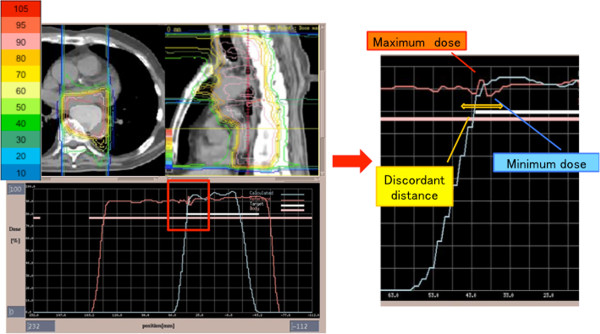
Figure 3.

D-SLIT dose distribution and profile. (Left) The upper figure shows dose distribution with D-SLIT in the axial view and sagittal view. PTV appears white in the axial view. Dose distributions in percentages (10-105%) are shown in the left bar chart. The lower figure shows the dose profile along the CC axis on the isocenter line. (Right) Enlarged dose profile around the field junction. Minimum dose, maximum dose, and discordant distance were calculated by treatment-planning system. To calculate discordant distance, all dose profiles were exported to a spreadsheet. At first, the dose increasing/decreasing region over 2% was extracted at intervals of 3-mm on the dose profile around field junction. Secondly, the starting points of does change in those regions were detected with 0.1-mm resolution. Then, the distance between two furthest points was calculated as the discordant distance.
