
Figure 5.
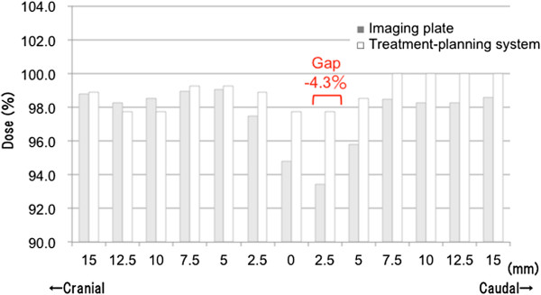
Comparison of dose distributions between the treatment-planning system and imaging plate. Dose distribution by the treatment-planning system and imaging plate (IP) along the CC axis on the isocenter line. White bars show the treatment-planning system, and gray bars show the imaging plate. The dose ‘gap’ between the treatment-planning system and IP was up to 4.3%.