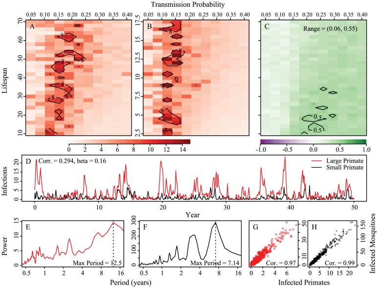
Figure 6. Stochastic formulation of the model.
Heatmap of the period of maximum Fourier spectra with corresponding example epidemic time series of prevalence. Panels A, B and C compare transmission probabilities (x-axis) and 1/birth rate (y-axis) for the large primate (panel A) and the small primate (panel B). Birthrates for the small primate are 1/4th of those of the large. Panel A shows periods of oscillations for large primates, B, periods of oscillations for small primates and C the correlation of the mean number of cases in a year (all panels are averaged over 25 runs). D is an example realization of the model with long-periodicity;  for both hosts and vectors equal to 0.16 and
  and 1/17.5 for the large and small primates, respectively. Fourier spectra for the large and small primate time series are shown in panels E and F, respectively. Panels G and H are scatterplots of the number of primate infections versus number of mosquito infections for the large and small primates and their corresponding mosquitoes, respectively. We see transmission dynamics in primates and mosquitoes are highly correlated. The coupling is 1/100 of the on-diagonal biting rates; other parameters are:
  ,
,  ,
,  ,
,  ,
,  , and
, and  ,
,  ,
,  .
.

