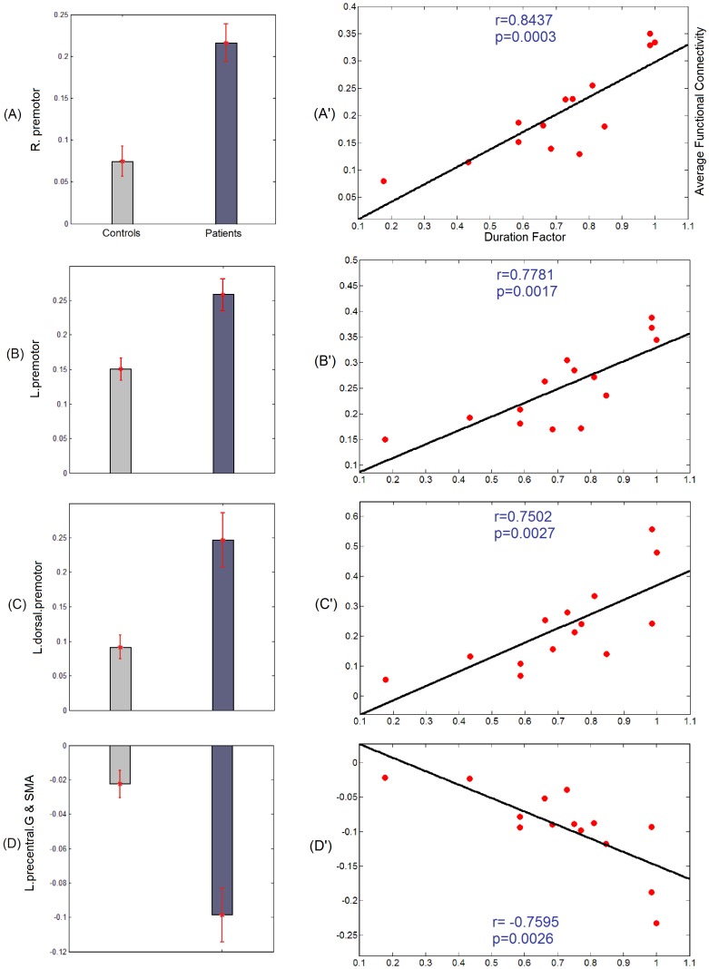
Figure 3. Results of correlation analysis for the seeds reported in Figure 1.
(A–D): Bar diagrams illustrating average functional connectivity within each group over the clusters of significant differences reported in Figure 1. Figure 3 (A, B) corresponding to the seed in medial superior frontal gyri, respectively illustrate the average functional connectivity within each group over clusters in the right and left premotor area. Figure 3 C corresponding to the seed in right precentral gyrus, illustrates the average functional connectivity within each group over a cluster in the left dorsal premotor area. Figure 3 D corresponding to the seed in the left medial prefrontal area, illustrates the average functional connectivity within each group over a cluster in the left precentral gyrus and the supplementary motor area. (A′–D′): average functional connectivity within patients for the clusters discussed in (A–D) as a function of the duration factor. The black line shows the fitted line for correlation analysis. Correlation coefficient r and p-value are shown for each correlation analysis.

