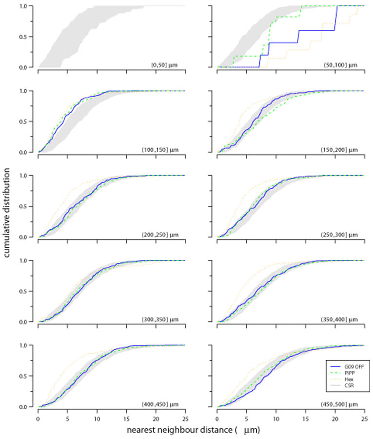
Figure 9.
Evaluating structure within each annulus of autocorrelograms using D measure. Each plot shows the cumulative distribution of points within an annulus to their nearest-neighbour; each annulus is 50 μm wide, noted in the bottom right of each plot as (lower, upper]. The cumulative distribution is shown for observed data (solid blue line: G09 off), and simulations from either PIPP (dashed green line) or low noise hexagonal lattice (dotted orange line). The grey region shows the 95% confidence interval derived from 99 simulations of CSR. See Figures 11 and 12 for statistical evaluation of the fits between the CSR envelope and the observed and simulated fields.

