
Fig. 4.—
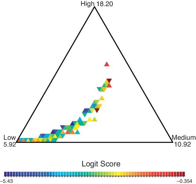
Locus-specific probabilities for the three death rate classes. The color of each triangle represents the frequency of loci that have death rate probabilities within the triangle, with dark red representing the triangles with the highest density of loci. The values of the death rates are indicated at the corners of the simplex. Loci that fall in the middle of the simplex have an equal probability of belonging to each rate class. The color scheme is set on the logit scale, defined as log odds of histogram frequencies. To convert back to the frequency scale, one can use the logistic function ( ). For example, the boundary logit scale values −5.43 and −0.354 correspond to frequencies 0.0044 and 0.41, respectively.