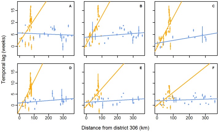
Figure 5. Scatterplot of mean annual temporal lags between epidemics against distances between districts.
Temporal lags between epidemics and distances are computed relative to district #306. The lines show the linear regressions between the mean annual temporal lag of the annual epidemic in each district and the distance for 2002 (A), 2003 (B), 2004 (C), 2005 (D), 2006 (E) and 2007 (F). Colours represent the geographic localisation of each district, according to Figure 4A. The number of districts included in the analysis changes every year, according to whether an epidemic occurred in the district (Table 1). Error bars represent the 95% C.I. associated with the mean. Normality and homoscedasticity of residuals were confirmed using the Shapiro-Wilks and the Bartlett tests respectively (alpha level of 0.05).

