
Fig. 3.
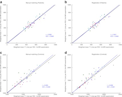
Weighted mean T1 value per ROI for all patients (a, b) and controls (c, d). Subjects are represented by different coloured markers. The weighted means of the T1 maps from the first and second MR examinations are plotted against each other with manual slice-matching (a, c) and automated registration (b, d). The black line represents y = x, which is the expected result at perfect registration and reproducibility; the blue line is a linear total least squares fit through the points; r represents the Pearson’s correlation coefficient of the points and ICC the intraclass correlation coefficient