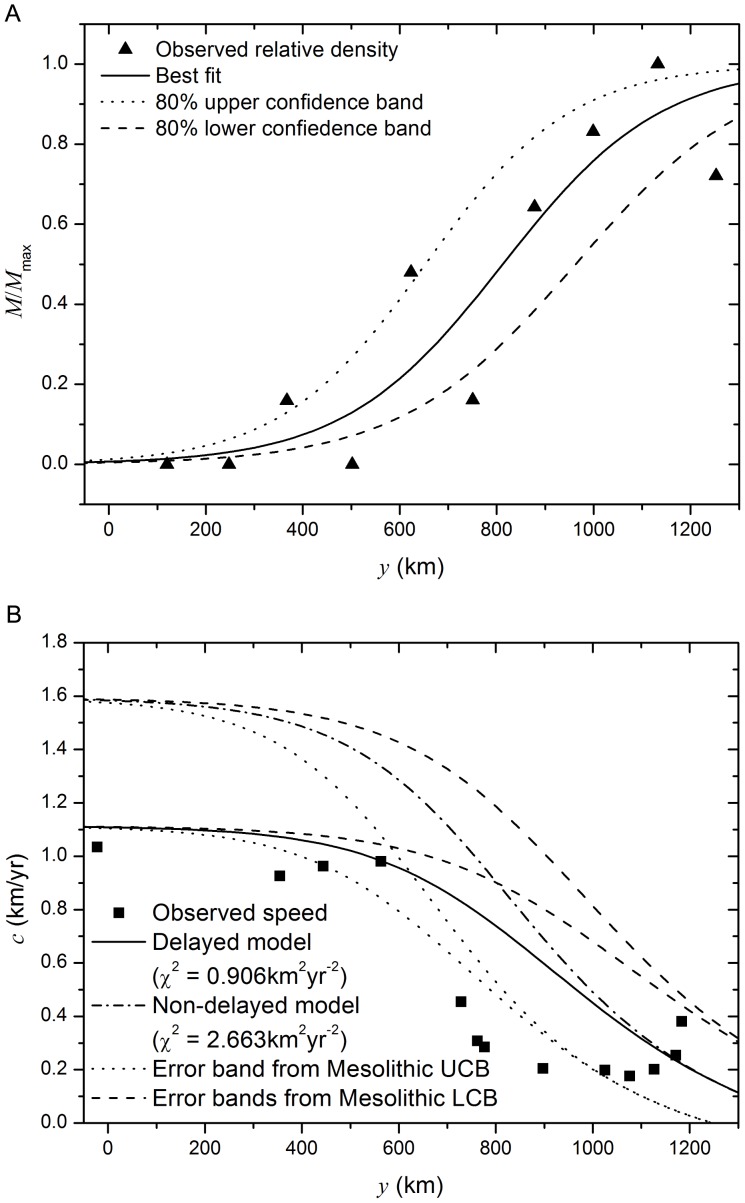
Figure 2.
a) Variation of the Mesolithic population density in the region of study. The triangles correspond to the archaeological data and the lines to the best fit (solid line) [28], and the upper and lower  confidence bands (dotted and dashed lines respectively). (
 and
and  for the best fit, solid line,
  and
and  for the upper band, dotted line, and
  and
and  for the lower band, dashed line.) b) Estimated and predicted speeds for the slowdown of the Neolithic transition. Symbols (squares): measured front speed from archaeological data for the region delimited in Fig. 1 (
 wide) and using
  intervals. Lines: Prediction from a time-delayed reaction diffusion-model with space competition between populations (solid line) and from a non-delayed model with space competition (dash-dotted line) when considering the best fit for the Mesolithic data, and when using the upper and lower bands for the Mesolithic population density (dotted and dashed lines respectively) from (a). (
 ,
,  and
and  .)
.)

