
Figure 5.
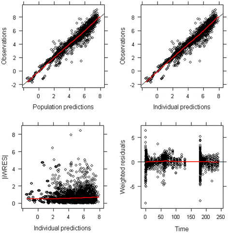
Diagnostic plots for the final population model including both brain and plasma (R)-[11C]verapamil concentrations. Each individual data point is represented by one dot. The red line represents the average observation. Observations are plotted against population predictions (upper left panel) and individual predictions (upper right panel). Data points are randomly distributed along the line of identity, indicating that the concentrations are adequately described by the model. Absolute individual weighted residuals versus individual predictions (lower left panel) and weighted residuals versus time (lower right panel) are plotted. Most residuals are clustered around zero, while there are outliers at early time points.