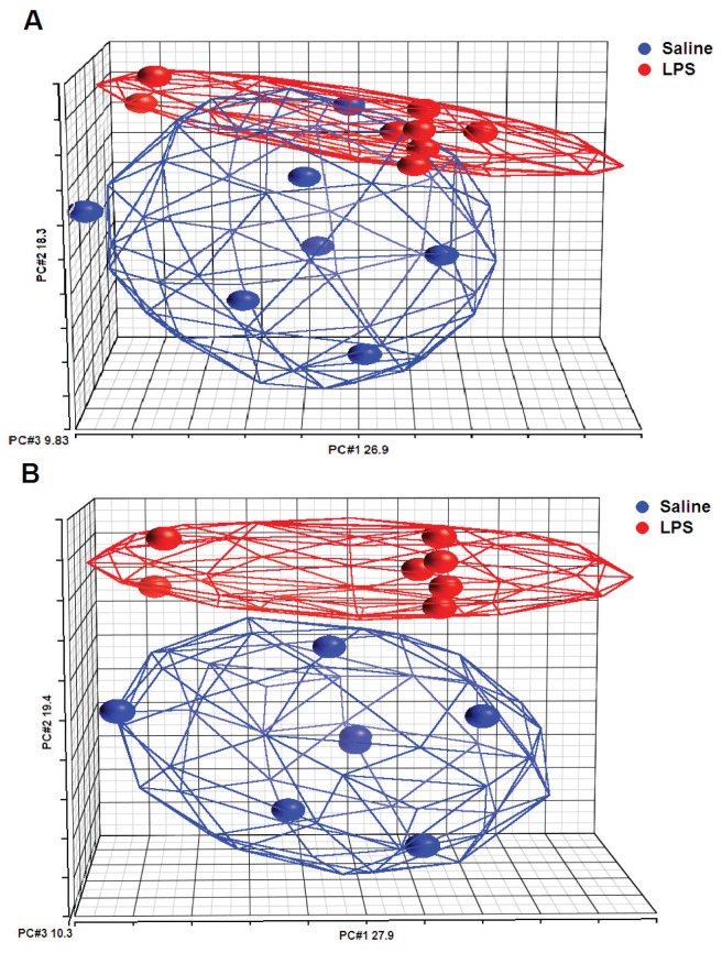
Figure 1.
Principal component (PC) analysis mapping of the samples from the whole microarray data. The color indicates the different groups (blue: saline samples; red: LPS samples) and ellipsoids are drawn around each group. (A) From the eight subjects, the total variation explained by PCs 1, 2 and 3 is 55%. Overlap is formed around saline and LPS samples. (B) From the seven subjects, the total variation explained by PCs 1, 2 and 3 is 57.5%. Clear clusters are formed around saline and LPS samples.

