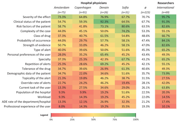
Figure 3.
Heat map of the context factors. The percentage of physicians in the study hospitals who found a context factor useful to prioritize and filter alerts is shown. An additional column presents the opinion of the CPOE researchers on the same question, obtained by a Delphi study [24]. Colors gradually vary from green (100%) to red (0%). The heat map is sorted descending according to the average frequency per context factor by the physicians.

