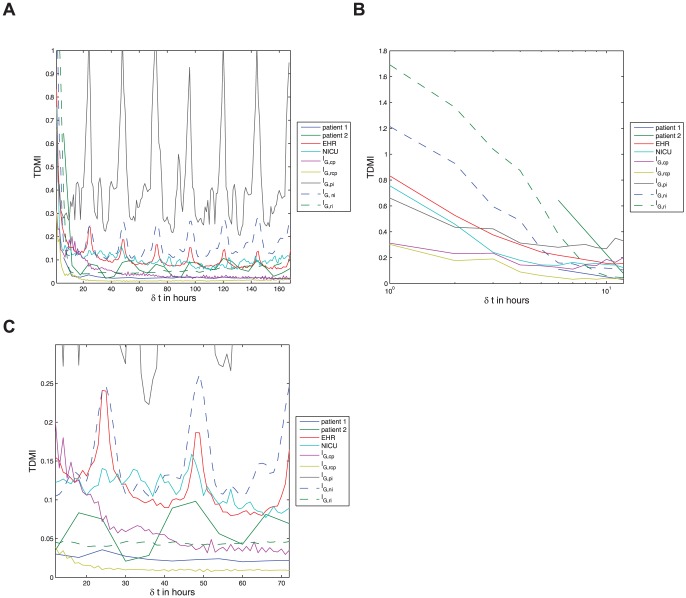
Figure 3. Depicted above are (a) the TDMI curves for all EHR-data based populations and model output for all feeding patterns resolved to one hour intervals for time delays of up to one week, note the sharp decay in TDMI in all cases, and the diurnal peaks in all periodically fed populations or models — note this plot is split into dynamical regimes in Figs. 2 and 2; (b) the TDMI curves for all populations and models over time-delays of  to
to  hours; and (c) the TDMI curves for all populations and models from
  to
to  hours, notice the diurnal peaks in all periodically fed populations or models. Recall that the model feeding patterns are given by:
  — continuously fed population;
  — continuously fed population with random
  hour gaps;
  — periodically fed individual;
  — noisy-periodically fed individual; and
  — a randomly fed individual.
(a) All data sets and models — a global view of the TDMI. (b) All data sets and models — feeding scale TDMI for  of
of  to
to  hours. (c) All data sets and models — diurnal scale TDMI for
  of
of  to
to  hours.

