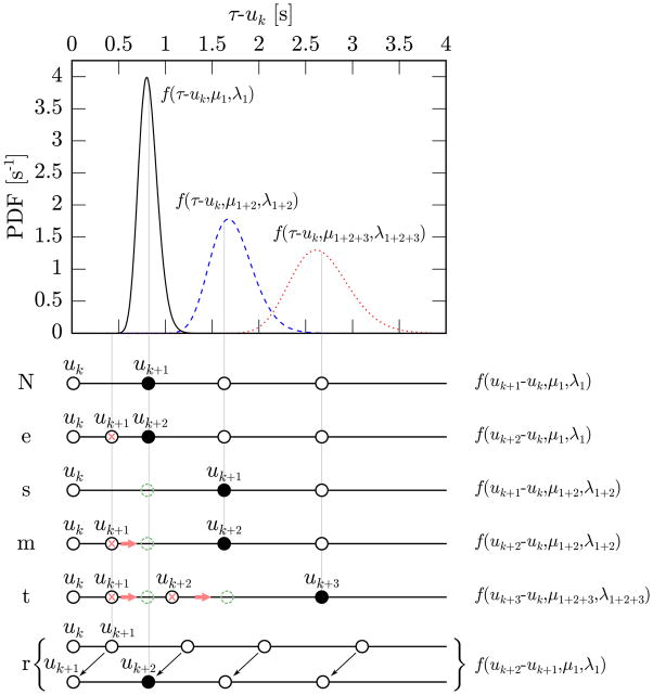
Fig. 1.
Schematic representation of the different hypotheses that we make for the beats following uk. The plot at the top shows the IG distribution of the time of occurrence of the first beat after uk (black solid line), the second one (blue dashed line) and the third one (red dotted line). All three probabilities are estimated at time uk and this explains why predictions that are further in the future present a wider variance. In the lower part of the figure, sample configurations of the beat times representing the different hypotheses (“N”, …, “r”) are reported. The black full circles indicate the beats for which the PDF on the right presents a high value; the crosses mark the beats that are going to be removed while the dashed circles are beats that need to be inserted. For example in the “e” case the beat uk+2 has high probability of being the first beat after uk (black bell) and for this reason the beat uk+1 will be removed (red cross). In the “m” case, instead, uk+1 has low probability of being the first beat after uk (black bell) while uk+2 has high probability of being the second beat after uk (blue bell) and, therefore, the beat uk+1 is removed from its current position (red cross) and shifted to its most likely position (green dashed circle).

