
Figure 3. Main effects of switching.
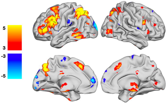
Regions with greater activity during switch trials are shown in YELLOW/ORANGE, and regions with greater activity during non-switch trials are shown in BLUE/GREEN. The t-maps have been thresholded at p < 0.05, corrected for multiple comparisons using False Discovery Rate (FDR). Color bars are expressed in terms of t-scores, and images are displayed in normal convention (left = left).