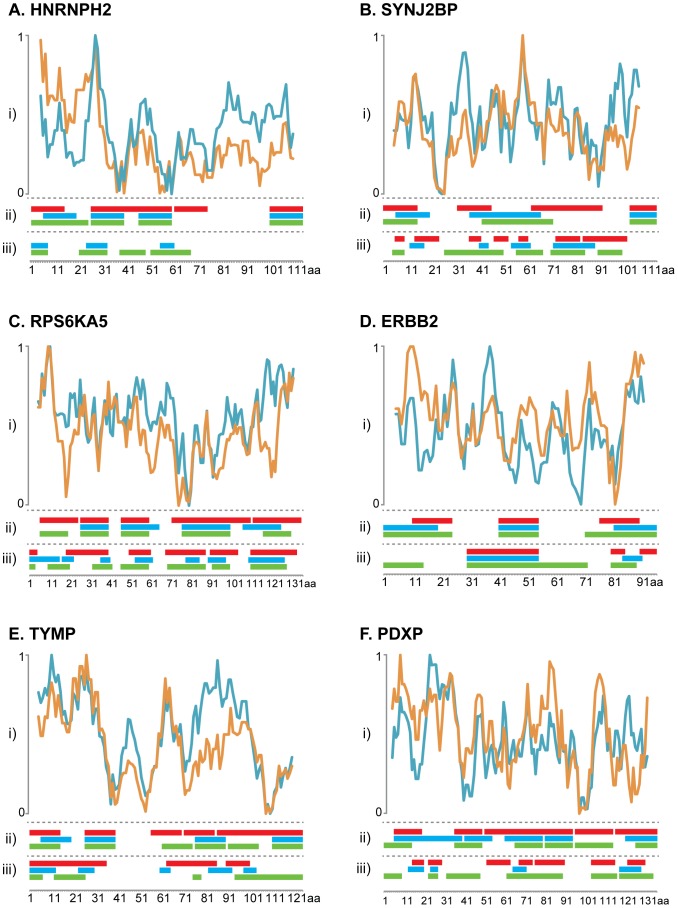
Figure 5. Schematic overview of the epitopes determined by the two methods and epitope prediction for the corresponding antigen.
(i) Plots show the hydrophilicity value predicted by Hopp and Woods (blue) and antibody response value by Rockberg and Uhlen (orange) for the six antigens analyzed by the both epitope mapping methods. The prediction plots are illustrated above the consensus epitope sequence from the suspension bead array shown in panel (ii) and the bacterial display in panel (iii) from the different antibodies shown as colored bars (Ab1: red, Ab2: blue and Ab3: green). The x-axis indicates the amino acid position in antigen sequence and the y-axis indicates the hydrophilicity score.

