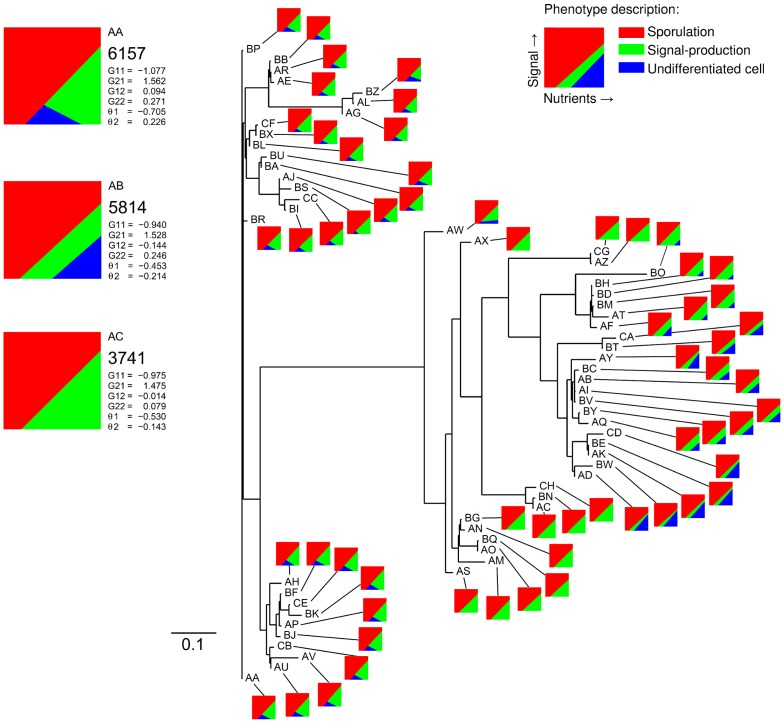
Figure 5. Unrooted phenogram based on the most-abundant genotypes at time step 550.000.
This diagram shows the phenotypic population structure at time step 550.000 based on genotypic relatedness. The horizontal lines represent the distances between genotypes. The distance between two genotypes is given by the sum of absolute differences between the connection weights and activation thresholds of both genotypes. Thus, closely related genotypes cluster together in the tree diagram. Only horizontal distances are informative, thus the upper and lower clusters are closer related to each other than either of them are to the biggest cluster of genotypes in the middle. From the tree one cannot infer evolutionary descendance, because it is unrooted. The tree is constructed from the distance matrix of the 60 most-abundant genotypes using the Fitch-Margoliash method (from the PHYLIP v3.69 package). The letter-code that is given to each genotype represents abundance, with ‘AA’ being the most-abundant genotype and ‘CH’ the least-abundant genotype. The three most-abundant genotypes and their associated phenotypes are shown in the upper left corner (AA, AB & AC). For each of these genotypes, we show the abundance, connection weights, activation thresholds and phenotype description. The phenotypes are described by a small diagram that shows the behavior of a cell for different environmental conditions: red area is sporulation; green area is signal production; and blue area is no differentiation. The parameter settings that are used for this simulation are the following:  ,
,  ,
,  ,
,  ,
,  ,
,  ,
,  ,
,  ,
,  ,
,  ,
,  ,
,  ,
,  ,
,  ,
,  ,
,  ,
,  and
and  .
.

