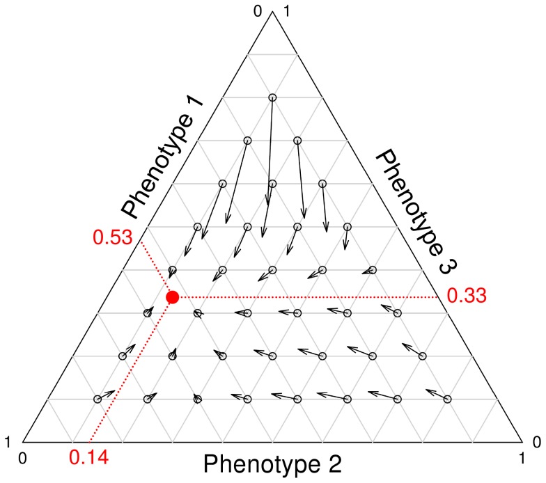
Figure 7. Selection pressures that act on the three most abundant phenotypes.
The direction of an arrow shows how the phenotype frequencies change over time. The length of an arrow indicates the speed of this change and hence the strength of selection. The red dot shows to the phenotype frequencies at equilibrium (i.e. the population state in which all phenotypes have exactly the same fitness). The frequency changes are determined from the onset of the current nutritional cycle to that of the next nutritional cycle. The calculations therefore include both cellular-level and colony-level selection. For the parameter settings see figure 5.

