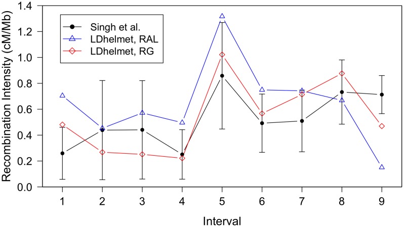
Figure 5. Comparison of LDhelmet estimates to the empirical genetic map of Singh et al.
The experimental genetic map of Singh et al.
[20] is shown in black with  confidence intervals. The LDhelmet estimate for the RAL sample is shown in blue, while the estimate for the RG sample is shown in red. The LDhelmet estimates were converted into units of cM/Mb by normalizing them to have the same total genetic distance as the empirical map for the region. The three maps demonstrate high correlation, especially near the center of the region, where they share the highest peak in the same interval.

