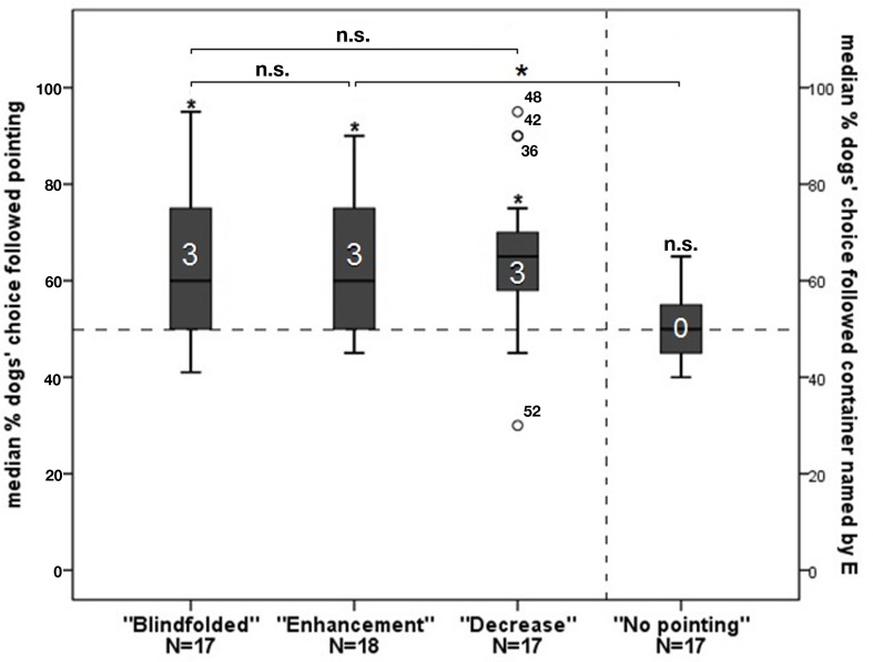
Figure 2.
The graph depicts box plots with the percentage of dogs’ choice. Each box plot represents the spread of the sample and variability is indicated by the distance between the whiskers. Within the filled areas are 50% of all data, divided by the median into quartiles. Outliers are represented with circles. The first three bars represent the choice following the pointing gesture of the experimenter, the fourth bar represents choosing a container the experimenter previously named to the owner as baited. An asterisk directly above a bar indicates a significant difference in group performance from chance level; the number in the bar indicates the individuals in that group performing above chance.

