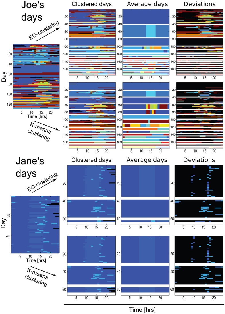
Figure 2. Patterns of life: Joe Random and Jane Regular.
Upper panel: Clustering result for the dayvectors of user Joe. Lower panel: Clustering result for the dayvectors of user Jane. In both panels, in the first row are the results obtained with the extremal optimization algorithm and in the second row the corresponding result with the k-means clustering. Each color is one location – the clusters are separated by white lines. The first column shows the unclustered days. The second and third column show the clustered days and the corresponding average days of each cluster. The last column shows the deviations from the average day, where the color of the location is only shown if it deviates from the location of the average day of the cluster – otherwise the color is black.

