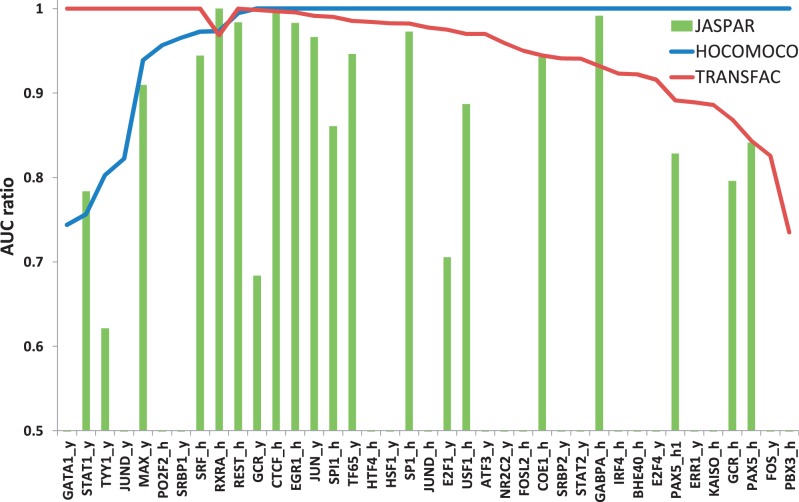
Figure 1.
Comparison of AUC ratios for TFBS models of JASPAR (green bars), TRANSFAC (red curve) and HOCOMOCO (blue curve) TFBS models. Value of 1 corresponds to the best model with the highest AUC value. Points on X-axis correspond to control sets for different TFs. Y-axis shows AUC ratios. If several TFBS models were present in a collection, the best result is shown. Details are given in the text.

