Figure 6.
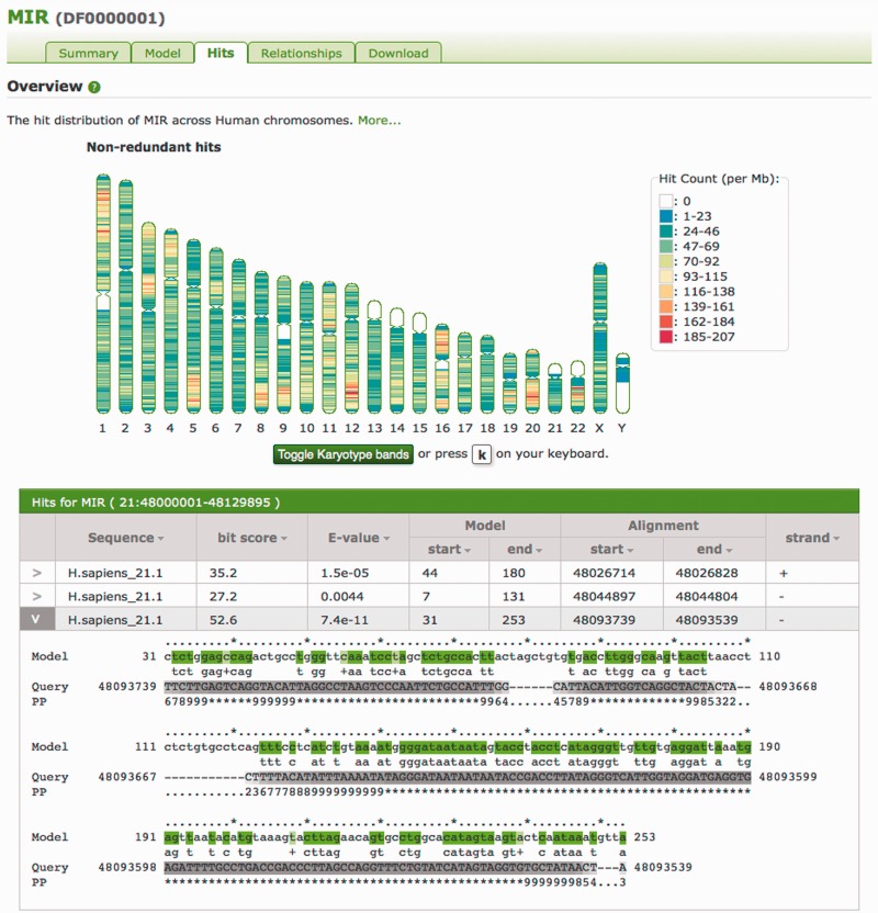
The Hits tab for the MIR (DF0000001) entry. This graphic shows the non-uniform distribution of MIRs across the human genome. Large patches of white in the hit distribution ideogram indicate regions with no instances of the model; in this case, these are particularly difficult to sequence heterochromatic regions (represented by N’s in the genome sequence) as can be seen by toggling karyotype bands. Below the karyotype ideogram are given the hits from a region on chromosome 21, with one hit expanded to show the alignment of that hit to the MIR model. In the alignment, the model line presents the consensus sequence for aligned states in the model, coloured according to the match line. The PP line represents the posterior probability, or degree of confidence in each aligned residue (for example, with ‘*’ meaning highest confidence, and low numbers indicating low confidence), with corresponding grey scale colouration of the Query sequence.

