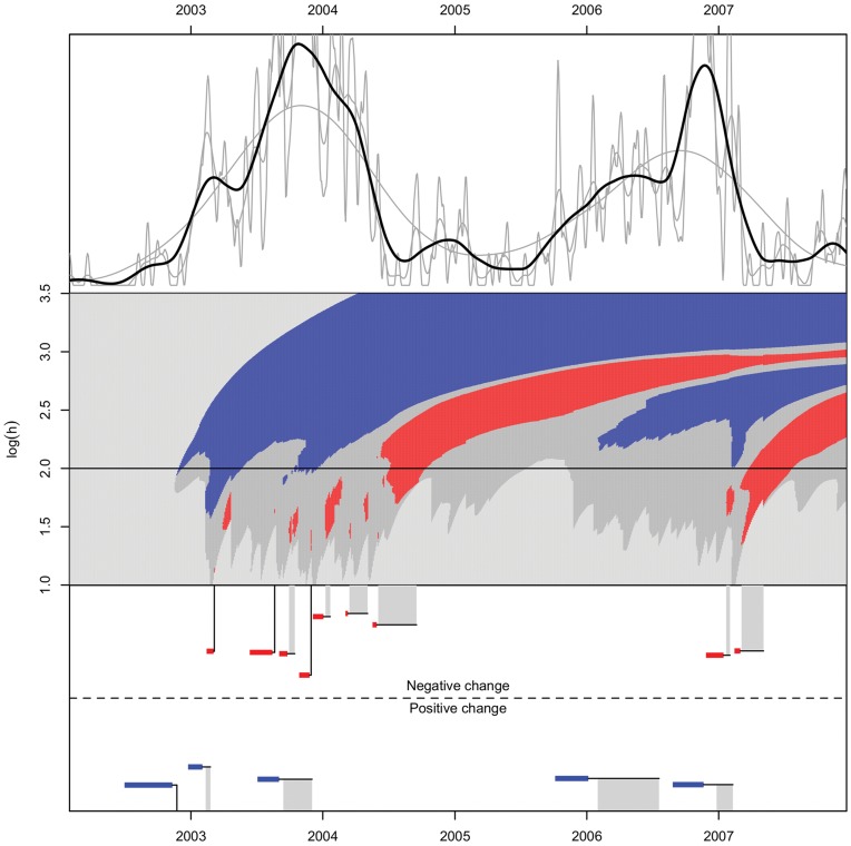
Figure 6. c-SiZer KDE analysis of incidence of Pertussis in North Norway in the period 2002–2007.
Upper panel: Kernel density estimates of confirmed cases of pertussis with varying bandwidths,  . No vertical scale is indicated since the live signal cannot be consistently normalized. Middle panel: The c-SiZer plot, where in shades of gray from light to dark (color online) indicate
  , no significant derivative, significant decrease (red), and significant increase (blue). No significant derivative means that the null hypothesis is not rejected. The horizontal line corresponds to the bandwidth used in the black line of the kernel density plot. Logarithm is taken base 10, h has units days in this and subsequent plots. The underlying data have a resolution of one day here and in Figure 7. Lower panel: Indication of the detected changes with the specification of the event interval after clustering. The horizontal colored lines indicate the inferred region for the change point, while the connected vertical line is the detection point. Vertical gray bars, show that the intervals are clustered and indicate the range in which the detections are made. For clarity the height of the change indicators in the lower panel are jittered.

