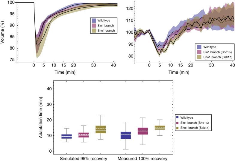
Figure 11.
Volume adaptation simulations and measurements after 0.2 M NaCl osmotic shock. For the time series, shaded coloured regions indicate respective interquartile ranges. We show measured volume curves of one representative experiment, whereas adaptation times are pooled over five independent experiments (Table II). In the box plot, solid lines are median, dashed lines mean, boxes indicate the interquartile range, whiskers minimum and maximum, and point are outliers beyond upper quartile +1.5*interquartile range. Source data is available for this figure in the Supplementary Information.

