
Figure 7.
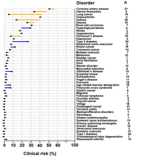
RiskOgram for 49 diseases. For each disease, the arrow represents the pretest probability according to the subject’s age, gender, and ethnicity. The line represents the post-test probability after incorporating the subject’s genome sequence. Orange line represents increased genetic risk, while blue line represents decreased genetic risk. Listed to the right are the numbers of independent disease-associated SNPs used to calculate the subject’s post-test probability.