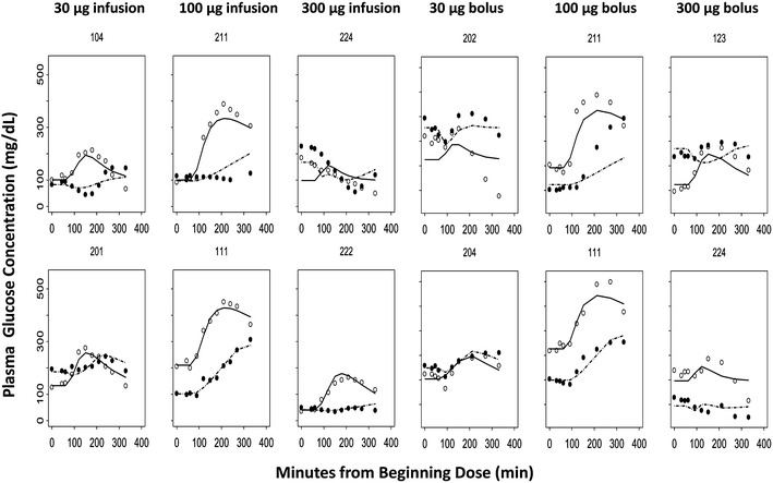
Fig. 5.

Time course of observed (symbols) and individual predicted (lines) plasma glucose concentrations in representative subjects for each dose group. The first row shows the worst fitting results, and the second row shows the best fittings from different dosing groups. Each panel graph represents placebo and active treatment crossover in the same subject with T1DM. Open circles and dashed lines represent placebo, and closed circles and solid lines represent the pramlintide treatment profiles
