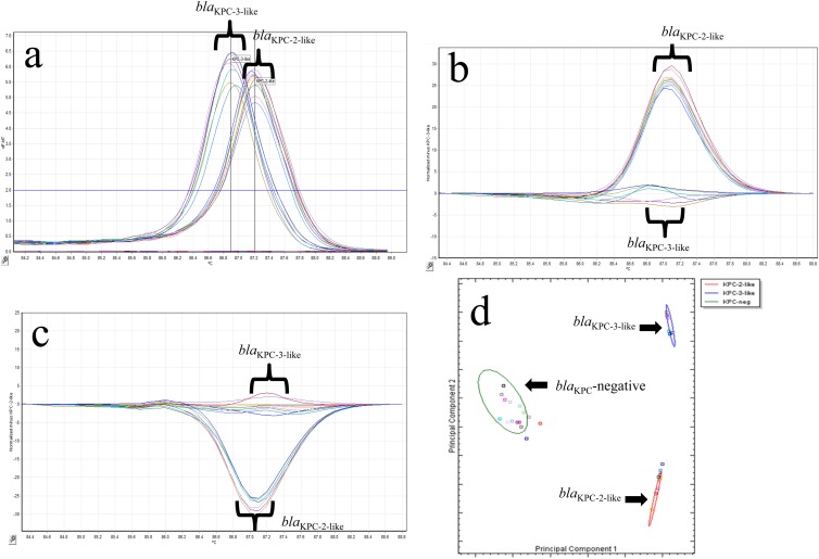
Fig 2.
(a) Representative melting curves for 17 isolates with blaKPC-2-like and blaKPC-3-like genotypes using single-tube analysis of blaKPC real-time PCR with HRM. The −dF/dT (negative first derivative of the change in fluorescence) is shown on the y axis, and the temperature shown on the x axis. (b) Representative difference graph of 10 KPC-2-like-producing isolates compared to 7 KPC-3-like-producing isolates using single-tube analysis of blaKPC real-time PCR with HRM. The relative fluorescence units compared to the genotype control are shown on the y axis; the temperature is shown on the x axis. (c) Representative difference graph of 7 KPC-3-like-producing isolates compared to 10 KPC-2-like-producing isolates using single-tube analysis of blaKPC real-time PCR with HRM. The relative fluorescence units compared to the genotype control are shown on the y axis; the temperature is shown on the x axis. (d) Cluster plot showing the differentiation of 17 isolates positive for KPC-2-like (red oval) or KPC-3-like (blue oval) and 16 KPC-negative samples (green oval) generated by the Rotor-Gene ScreenClust HRM software.

