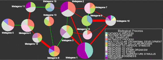
Figure 5.
Metagene Correlation Network for Biological Processes. Each node in this network represents a metagene. The size of each node is proportional to the activity of the metagene within the dataset. The width of lines between a pair of nodes is proportional to the strength of the correlation between them. Positive correlations are denoted by red lines, and negative correlations by green lines. Only Spearman correlations with a p-value less than 10-12 are visible. The pie slices within each node represent the amount of enrichment for specific gene ontologies (the NES score).

