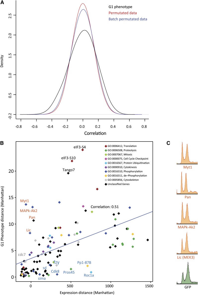
Figure 5 .
Correlation between gene expression and G1 content. (A) Density plot of correlation coefficients between gene expressions and G1 content (black line) shows that expression of a subset genes correlate with G1 phenotype better than expected by random. Colored lines represent randomized data, permutated globally (red) or according to treatment batch (blue). Note that maximum correlation is relatively weak (less than 0.6 in either direction). (B) G1 phenotype strength plotted as a function of total effect (Manhattan distance) of the same RNAi treatment on gene expression (effect of GFP dsRNA normalized to 0). Although there is overall correlation between G1 and gene expression, several genes have much stronger effect on either G1 (red typeface) or gene expression (blue typeface). (C) Flow cytometric phenotypes of the four experiments showing a strong G1 phenotype with little effect on gene expression.

