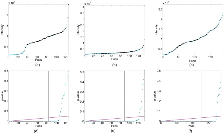
Figure 3. Original intensity curves and the corresponding p-value curves.
(a) and (d): sorted intensity curve (a) and the corresponding p-value curve (d) of peaks predicted by PICKY on the 2D 15N-HSQC spectrum of the protein TM1112; (b) and (e): sorted intensity curve (b) and the corresponding p-value curve (e) of peaks predicted by PICKY on the 3D HNCO spectrum of the protein COILIN; (c) and (f): sorted intensity curve (c) and the corresponding p-value curve (f) of peaks predicted by PICKY on the 3D CBCA(CO)NH spectrum of the protein RP3384. In these figures, true peaks are shown in black and false ones are shown in cyan. In (d), (e) and (f), the decision boundaries of  and the B-H procedure are shown in black and magenta, respectively.

