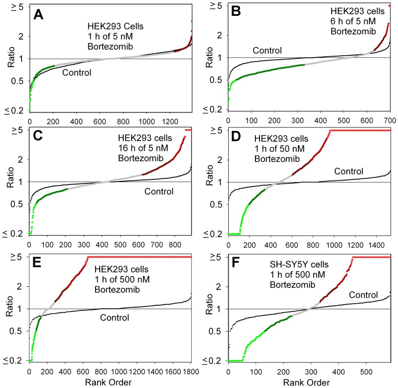
Figure 2. Summary plots of peptidomic analysis.
The level of peptide in each biological replicate, relative to the average control level, was determined for all peptides detected in the analysis of the MS data. For this analysis, if the ratio was <0.20 or >5.0 between the drug-treated samples and the average control, it was capped at 0.20 or 5.0. The ratios for all detected peptides in each experiment were then sorted from low to high and the result plotted. The y-axis represents the observed ratio (log scale) and the x-axis represents each individual replicate. In each panel, two plots are shown: one plot shows the differences between the bortezomib-treated samples and the average control value (large colored circles), the other plot shows the relative level of each control replicate compared to the average control value (small black circles). For the bortezomib-treated samples, the color of the circle corresponds to the color scheme used in figures 3 and 5. Panels A-E show data from experiments on HEK293T cells; Panel F is for SH-SY5Y cells. Panels A-C tested 5 nM bortezomib for either 1 hour (A), 6 hours (B), or 16 hours (C). Panels D-E examined 1 hour time points with either 50 nM bortezomib (D) or 500 nM bortezomib (E, F).

