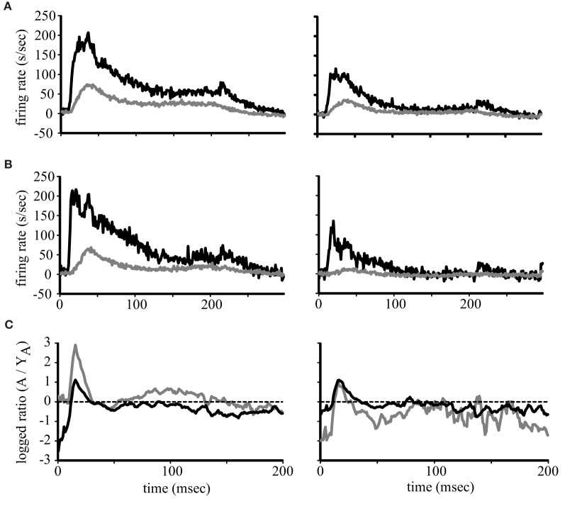
Figure 3.
Population firing rates. Each line represents the average firing rate across the population of neurons in young (gray lines) and aged (black lines) monkeys for A1 (A) and CL (B). The response to the best direction is to the left and the worst direction to the right. Panel (C) shows the logged ratio between young and aged monkeys during the first 200 ms of the response.

