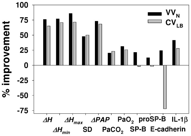
Figure 8. Comparison of ventilation modes.

The graph compares the average improvements of VVN and CVLB over CV. The SD bar represents different experimental conditions including 2 PEEP levels and normal lung from our previous study [27]. Only those parameters are included for which either CVLB, VVN or both significantly improved over CV. See text for more explanation.
