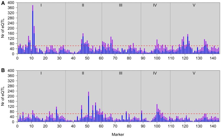
Figure 2.
Genomic distributions of eQTLs in GG2 (A; this study) and GG1 (B; Keurentjes et al., 2007). Bars represent the number of local (in cis; purple) and distant (in trans; blue) eQTL peaks detected at each marker position. The horizontal red lines represent the significance threshold values for defining a hotspot. Gray vertical lines depict chromosomal borders, chromosomes (I–V) are indicated at the top.

