
Figure 3.
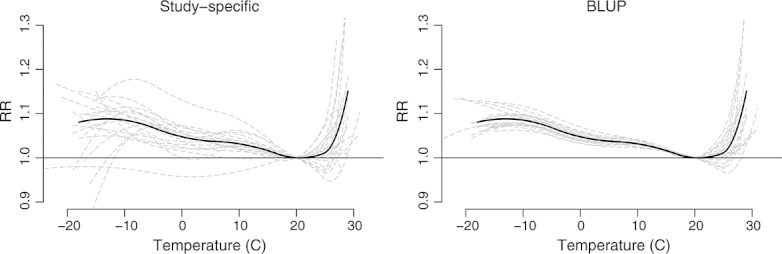
First-stage (left) and best linear unbiased predicted (right) estimates of the exposure–response relationships in relative risk between temperature and non-accidental mortality in 20 US cities, 1987–2000. The continuous bold black line represents the population-average curve, whereas the long-dashed grey lines are the study-specific estimates. Reference at 20°C.