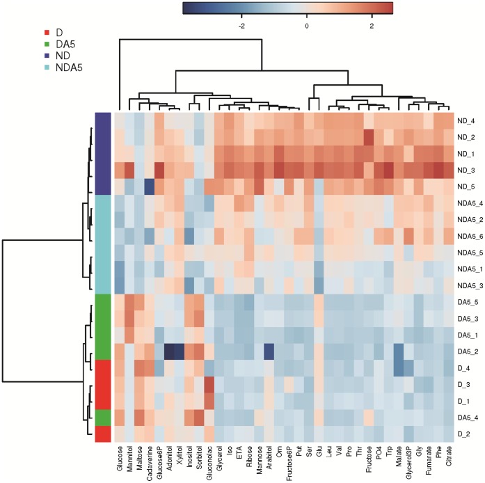
Figure 6. Heatmap of the entire metabolomics dataset.
The colors represent the cube root changes of each metabolite relative to the mean control level. Individual samples (horizontal axis) and compounds (vertical axis) are separated using hierarchical clustering (Ward’s algorithm), with the dendrogram being scaled to represent the distance between each branch (distance measure: Pearson’s correlation). The clusters containing D and DA5 females are highlighted red and green, respectively. The clusters containing ND and NDA5 females are highlighted in dark and light blue, respectively.

