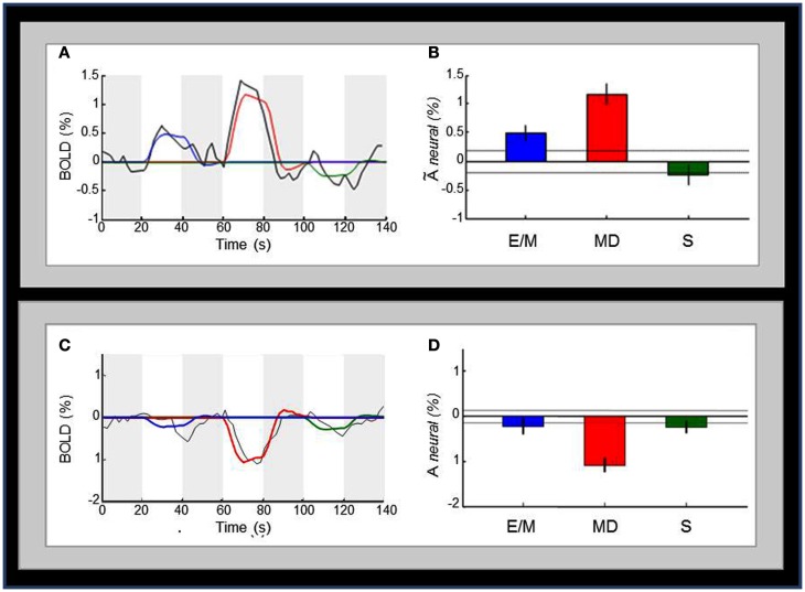
Figure 7.
Comparison of the activation pattern across the three tasks. (A) Average time-courses of BOLD activity (black curve) in V1 for the sequence of the E/M, MD, and S task intervals (white bars); the colored curves are the best fits of the model predictions for the three tasks to the time course; the four dark-gray bars indicate the 20 s null intervals separating the three tasks. (B) Bar-graphs for the estimated V1 activation for each task; the activation levels refer to the beta weights for the event types in the GLM. Dotted lines and the error bars represent confidence intervals for two different forms of statistical comparison of the activation levels. Dotted lines represent the 99% “zero” confidence interval, within which the activations are not significantly different from zero. Error bars are 99% “difference” confidence intervals designed to illustrate the t-test to assess the significance of the differences between pairs of activation levels in each figure, i.e., amplitude differences are not significant unless they exceed the confidence intervals for both compared activations. (C) Average time-courses of BOLD activity in the deactivated regions surrounding V1. (D) Bar-graphs of estimated activation for each task for the deactivated regions presented in (C). Conventions in (C,D) are as in (A,B), respectively.

